JUSTGO.COM
_________
JUSTGO.COM _________
I designed a new flight booking website for the final project for my professional diploma in UX design.
I was responsible for every stage of the UX design process, from research to final design and created a product with exceptional functional and experiential design, while maintaining a simple and visually pleasing aesthetic.
Hidden costs, particularly those related to baggage, were a significant source of frustration for most flight booking website users - addressing this issue became a key focus of the project.
RESEARCH
RESEARCH
Online Servery
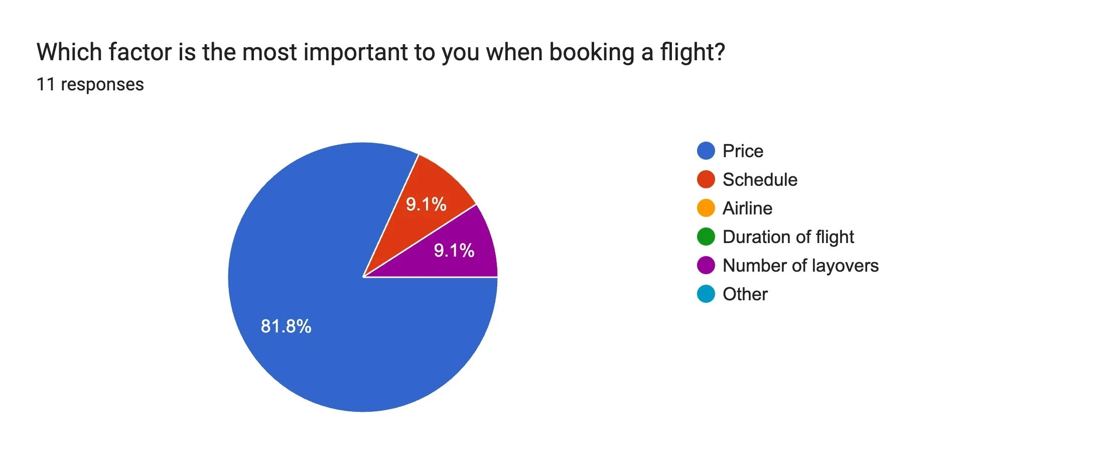
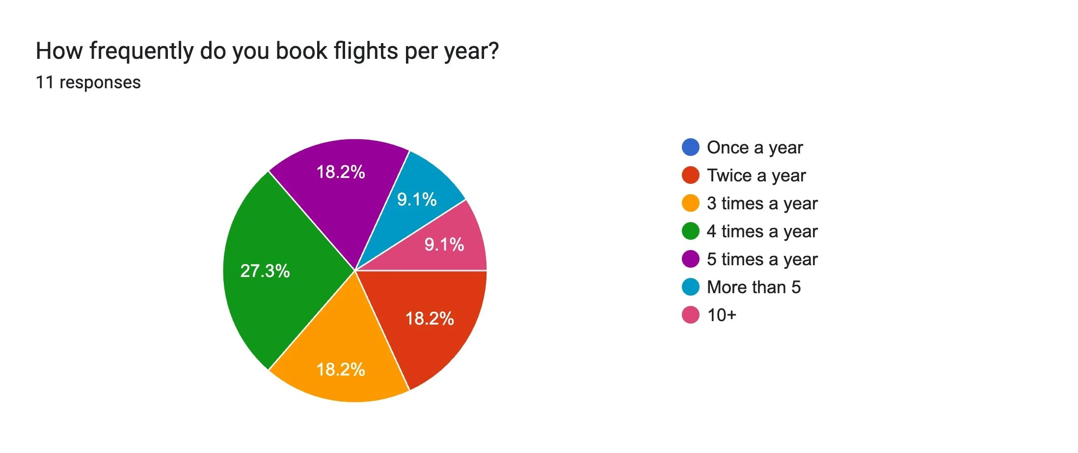
Online surveys are a quick and affective method to gather quantitive and qualitative data. I focused on the three golden questions:
Why did you visit the website?
Were you able to complete your task?
What would you change about the website?

Usability Testing
Usability testing was conducted on several established flight booking websites. I recruited one user and were provided with two pre-recorded tests from the UX Design Institute.
Issues identified included the following:
Make key action buttons, such as "Search Flights", more prominent
Streamline fare selection by providing clear, concise explanations and reducing redundant prompts
Reformat flight timing details to avoid confusion between departure and arrival times
Remove unavailable options from the interface to minimise distractions
Simplify baggage policies by offering clear descriptions of what is included in each fare tier
DEFINE
DEFINE
Affinity Diagram and Customer Journey
Now it was time to make sense of the data gathered during the research phase. Affinity diagrams and customer journey maps were sed to do this.
Notes were made from the research stage and then grouped into themes and patterns, this uncovered underlying trends and user needs. The grouping highlighted points at each stage that facilitated flow as well as pain points.
Customer journey mapping highlighted several user problems and opportunities, particularly during the flight selection stages of the customer journey. These stages received special attention during the design process.
-->
-->
Research Take Aways and Definition of Key Issues
-
Nothing should need to be added at later stages
-
These need to be displayed simply
-
This is the information which should be prominently displayed
-
Most users are familiar with a certain mental model for flight booking websites and this model should be stuck to
DESIGN
DESIGN
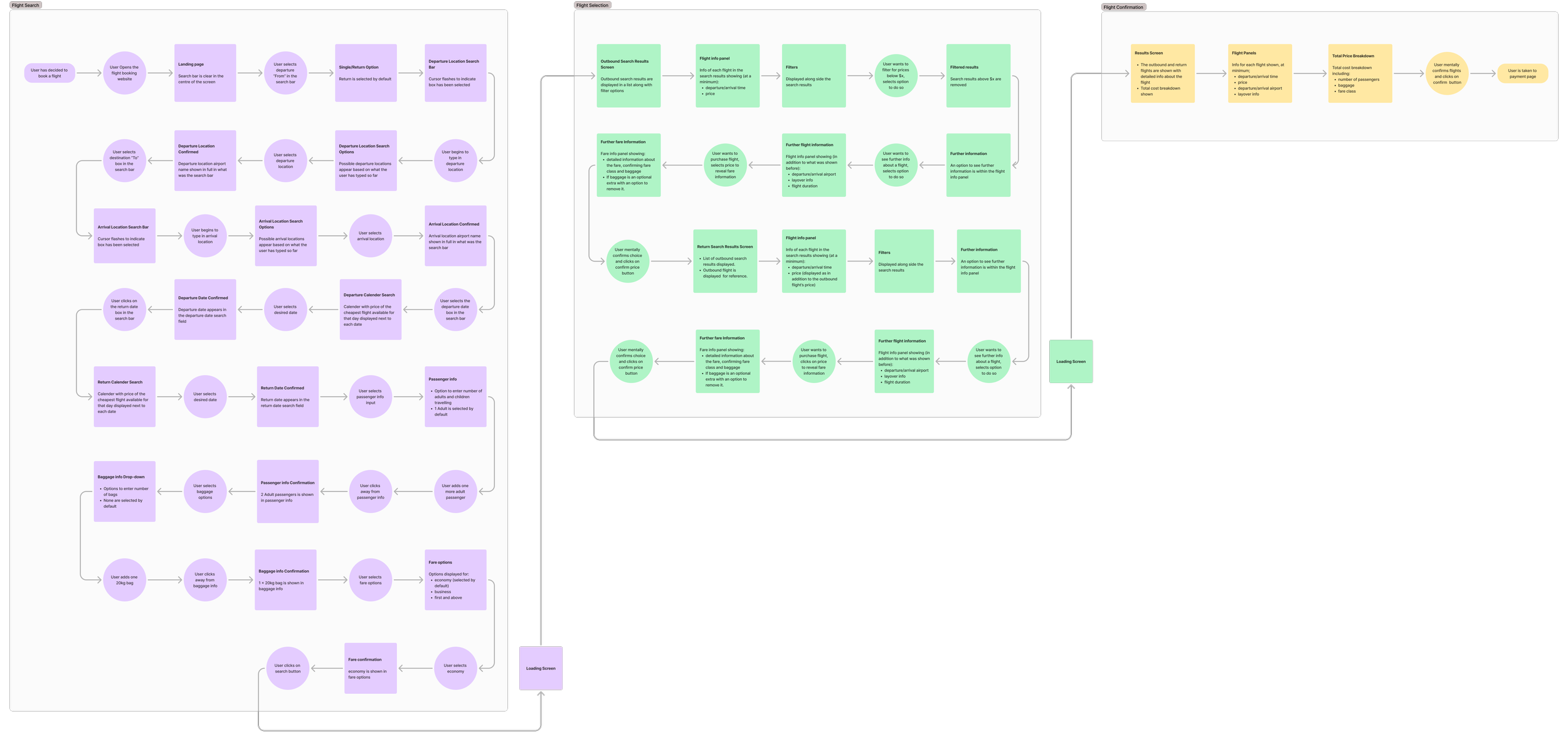
Flow Diagram
The design process started by creating a flow diagram for an ideal product so that I could understand where the screens and their states I would create will fit within the structure.
The flow diagram adhered to the established mental model for flight booking websites:
Landing page with a search field
Outbound flight results/selection
Return flight results/selection
Flight confirmation
Passenger details
Payment
With the flow established, I moved on to creating screen sketches.
Sketches
My sketches were informed by initial user interviews, research findings, and the heuristic evaluation.
As gathered from the research, it was necessary that all costs were transparent from the beginning. To address this, I decided to include a baggage selection option in the search field - never found on other websites.

Initial Prototype
Initial prototyping was done on Figma. I translated my sketches into a medium-fidelity prototype, allowing a test user to book a flight, including baggage options, from Singapore to Bangkok for the dates 25/10/2024 to 04/11/2024.
A light, minimalist visual style that was both visually pleasing and free of distractions with inspiration drawn from the iOS style guide.
Validate
Validation is a key part of the iterative UX design process, I recruited a participant and conducted a usability test based on using the prototype I had just created.
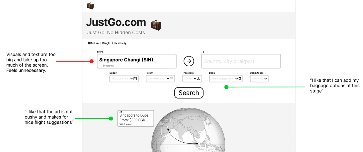
Feedback from user testing was that:
Costs were clear and upfront
Advertising was included in a non-intrusive way
Was clear and easy to use
FINAL_DESIGN
FINAL_DESIGN
For the final design text and visuals were made smaller to improve scan-ability and facilitate comparison of search results, while also reducing the overwhelming feeling caused by large visuals. Additionally, the results filters are no longer hidden, allowing users to see which filters have been applied while comparing the results.
BUILD
BUILD
Annotations and Handover
Now that I was satisfied with the design and had validated it, it was time to hand it over to the developers for implementation. This involved annotating my designs to minimise the need for interpretation. The annotations included:
The rules and functions of each interaction
The behaviour of elements upon interaction
The feedback provided in case of errors
